Capstone project
ZG Magazine makes a comeback for 2022
This is a case study for the final week of SuperHi’s Visual Design + Branding course.
Overview
My role:
Creative Direction, Research, UX/UI design, Branding
Year: 2022
Goal
Not only to create a website and a new brand presence for an out-of-print publication, but to translate the spirit of the magazine into a digital experience.

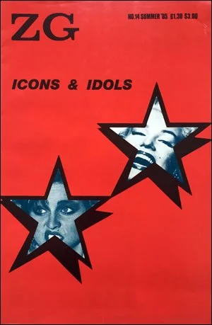
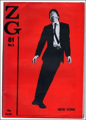
When ZG Magazine was in print
Concept
It’s a mystery what ‘Z.G.’ stands for, but I’m going to guess it’s zeitgeist! If you’re not familiar with this word, this is how Oxford Languages defines it:
Zeitgeist: the defining spirit or mood of a particular period of history as shown by the ideas and beliefs of the time.
I let this definition be the core idea for the project.
The original printed magazine had an overarching theme for each issue and I wanted to carry this forward. I landed on stoic philosophy. As unbelievable as it sounds, for many reasons: stoic philosophy is really popular right now. A bonus was that I’ve read a lot about it; Ryan Holiday is a favorite author of mine. Since It’s an ancient subject with universal themes that I thought would be represented in different art forms.
Challenges of remaking ZG Magazine in 2022
There were several challenges in executing ZG Magazine:
Making it user-friendly but also appealing to the art community. The art world can be pretentious and exclusive to those who don’t participate often or at all. I believe the art media has the potential to make the art world more user-friendly. Although you do still have to balance accessibility with the art world status quo — the art world like things to be different, innovative, and abstract. Balancing both was my goal, in both the writing and the design
Online but make it print. I love print media. however, translating the same experience online isn’t easy. Especially on mobile phones. (Feat Magazine and Miramono were two examples of blogs that I thought did a good job doing this). However as we’re well aware, everything is shifting to digital, so I wanted to follow digital design best practices.
Keeping the spirit of ZG Magazine but making it relevant for 2022. Trying to balance both who ZG Magazine was but reinterpreting it for a 2022 audience.
Content, content, content! I had to not only design the blog but also designed some of the content. *wipes forehead*.
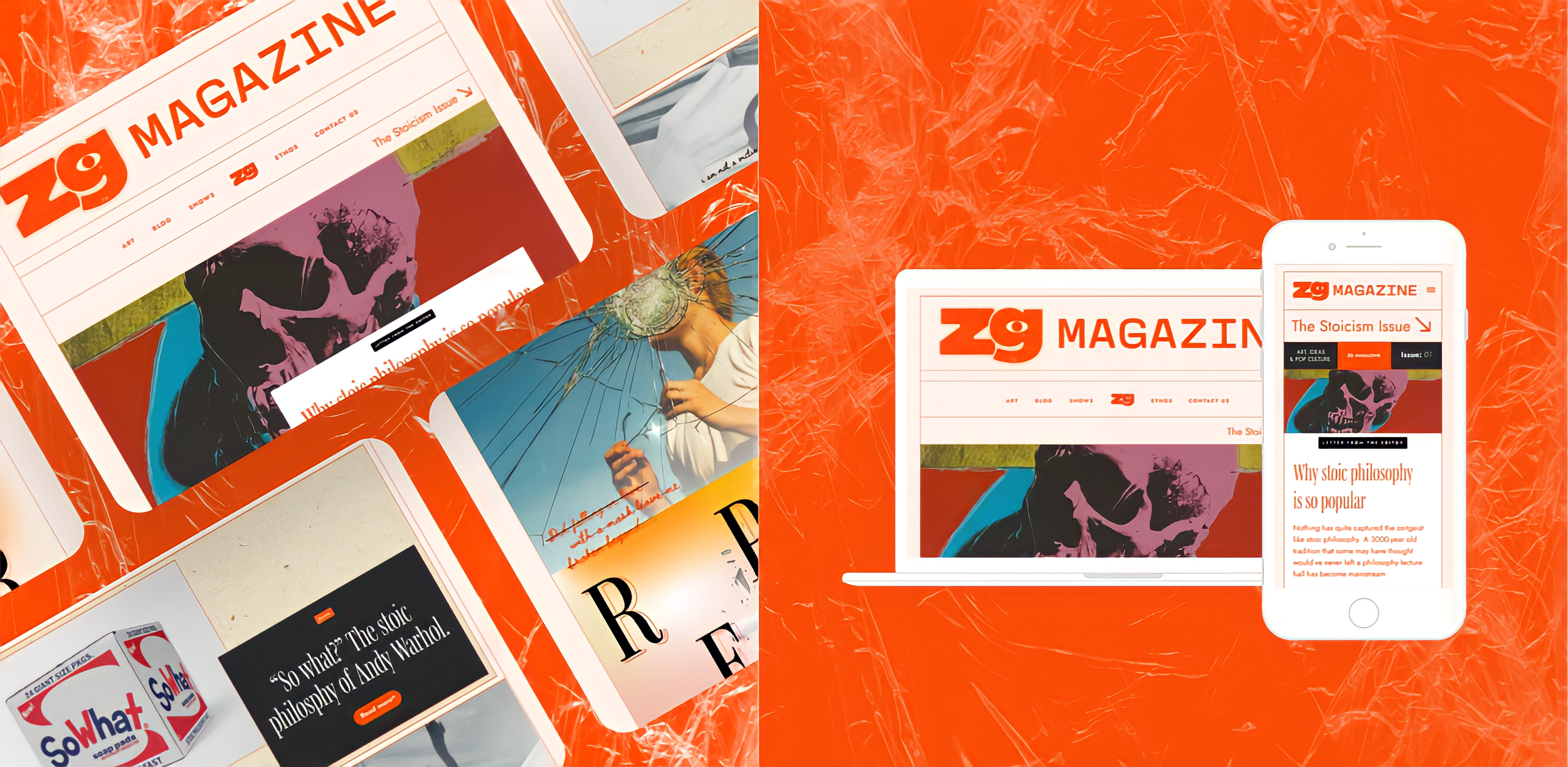
The visual design of ZG Magazine
Brand Identity (color palette, typeface, and logo)
The brand identity came to life after a lot of experimentation. The goal was to make it friendlier and more vibrant. Mainstream design is fun in 2022. Popular content right now is light-hearted and camp. At the same time, I did want to keep some of the original identity.
Colour
I really liked the use of black and orange. It was actually a trend I kept seeing in my research.
For the typeface choice, I went with Mencken for the headlines which I feel captures the editorial feel while also being current. I paired it with Jost to be used for body copy. To me, Jost is a friendlier alternative to Helvetica; it feels less serious but it still has a high-brow look. It’s also great for digital and pares nicely with Menchken.


I landed on three brand colours: blood orange, cream and black.
Experimentation used to select the ZG Magazine
colour palette.
Brandmark and logo
ZG Magazine’s previous logo was serious and pared down. I wanted it to be more fun. I included an all-seeing eye (think the NFB logo and the CBS logo) as it represents delivering a specific perspective and vision to its audience. It also gives it a human feel.

The ZG Magazine brandmark
The ZG Magazine brandmark + wordmark
Layout and user-experience
Design process
Design framework
The initial goals of this project were to balance the visual looks of a print publication while keeping online best practices. I also wanted something that would be mobile-friendly.
As this was an art and content blog, the user would want to see big, bold images: it’s why they’re visiting this site! I decided to use specific sections for visual spreads that emulates a magazine layout. Each section is also contained using lines to avoid confusion.
Mood boarding and wireframing
I looked to some of my favorite websites, online magazines, and blogs to see what was happening in the market. After I got a sense of the aesthetic, I thought about the layout and visual hierarchy, and then I got to work.

My sketches for the layout
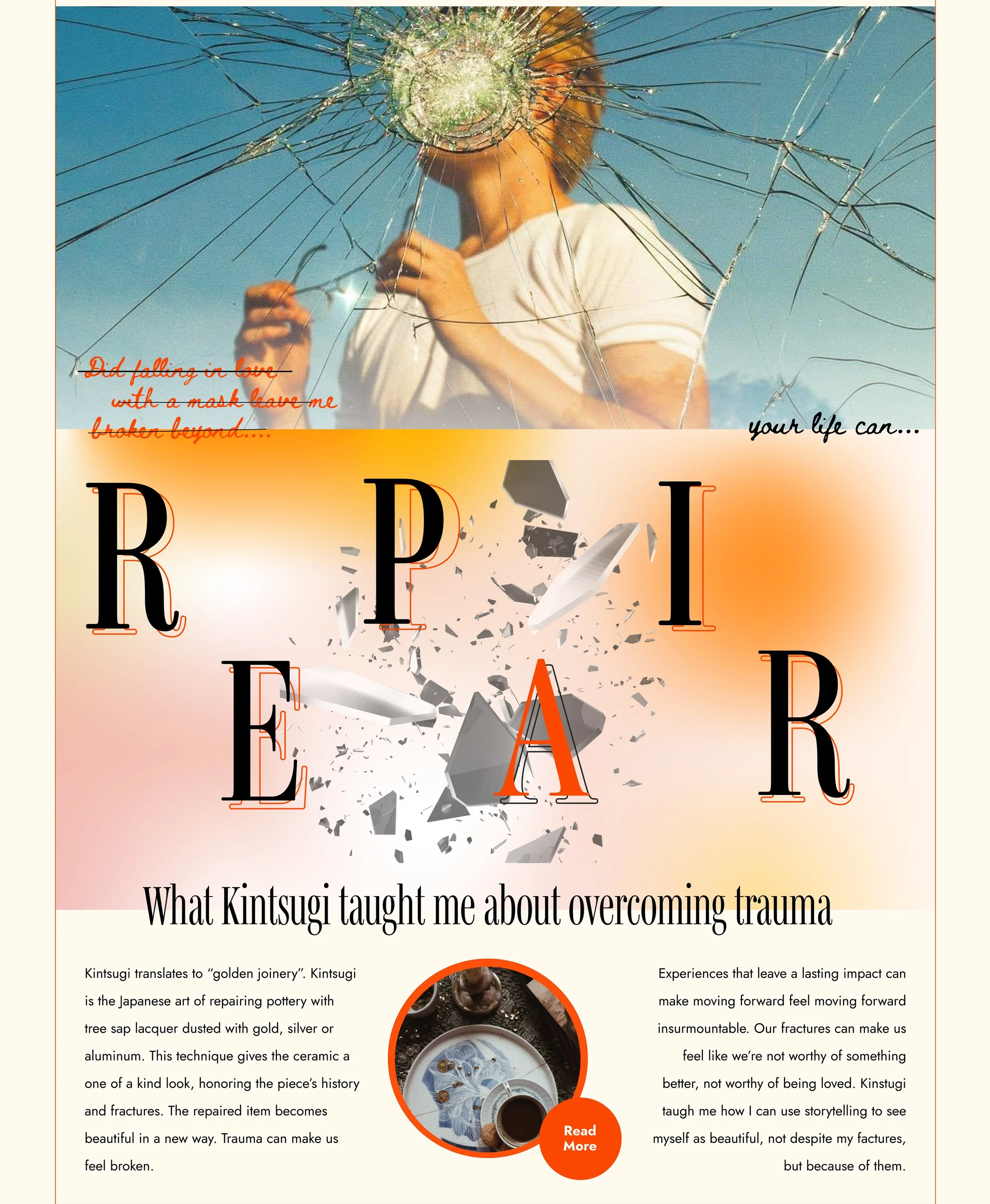
Final version. An example of an editorial look
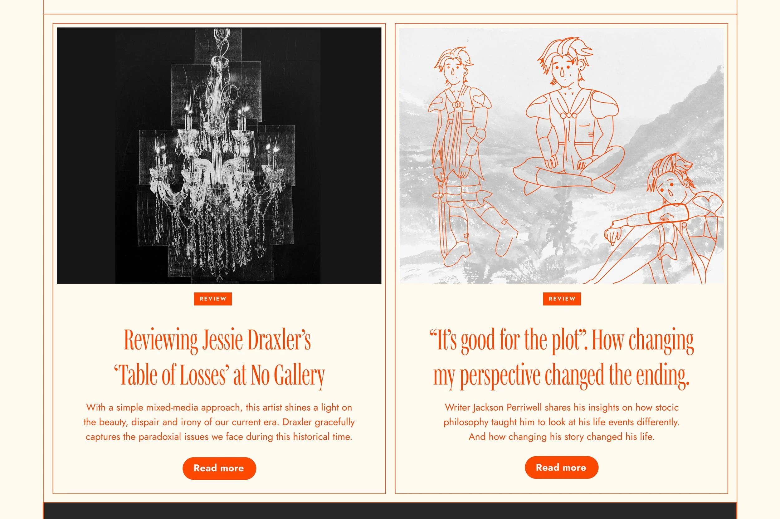
Final version (This is a section inspired by web design best practices)
Content strategy
I created metatags for the content to follow under included: art, blog, review, interview, and letter from the editor.
Original content
One piece of original content that I was particularly proud of was “So What?” It was inspired by a quote that I felt showed how Andy Warhol expressed stoic ideas through his work. I had a good time coming up with original pieces of content albeit time-consuming!
Challenges and future versions
The biggest challenge was actually thinking outside the box. As someone who is relatively still inexperienced in design, I felt like I’m still at the phase where I’m learning and practicing the rules. Looking at other art publications you can see how unafraid they were to do something different; I’m still getting my grounding as it felt scary (not to be dramatic) at times. Treating text less than 16 pts is too much for me! I’ve learned that I am in my comfort zone with standard web design.
Another challenge is that it was quite difficult to come up with original ideas for content in tandem with creating web design. It took a lot of time and soul searching to come up with content. Writing is such a difficult task on its own, so I had to let my perfectionistic streak go and accept my writing for where it was at.
Some things I would consider:
How can we create something original?
What is the next theme that ties into who ZG magazine is?
How can we continue to make the art world accessible through content and design?
How can we give value to our users while maintaining ZG Magazine’s identity?
How can we explore revenue streams without sacrificing who ZG Magazine is?
How can I bring more analog design for the next issue?